Description
Steps to Make an Element Visible on Desktop, Mobile, or Tablet in WPBakery Page Builder
To control the visibility of an element on desktop, mobile, or tablet in WPBakery Page Builder, you can use the built-in Responsive Options feature. This allows you to decide which devices (desktop, tablet, or mobile) can see a specific element.
1. Open WPBakery Page Builder:
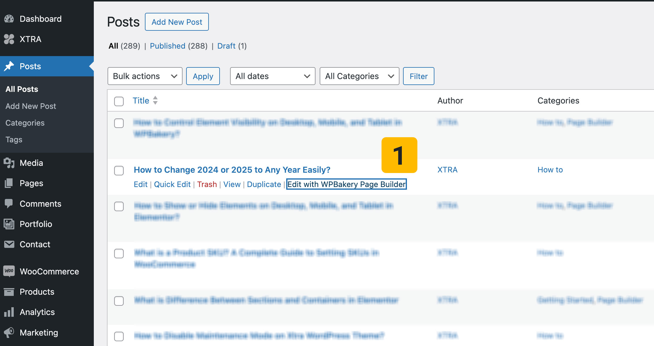
Go to the page you want to edit and click Edit with WPBakery Page Builder.
2. Select the Element:
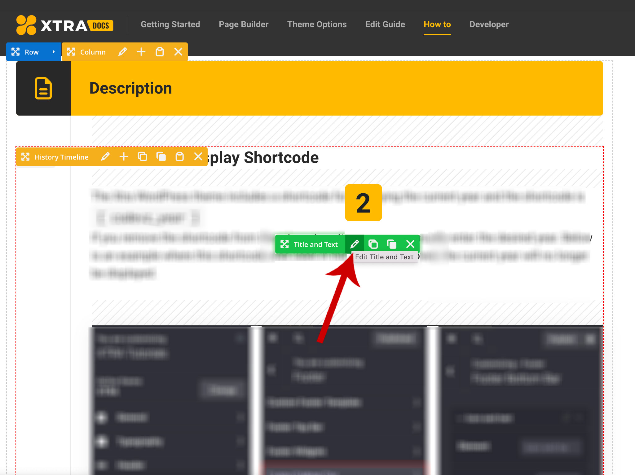
Find the element (row, column, or module) you want to control and click on the Edit button (pencil icon).
3. Go to the Responsive Options:
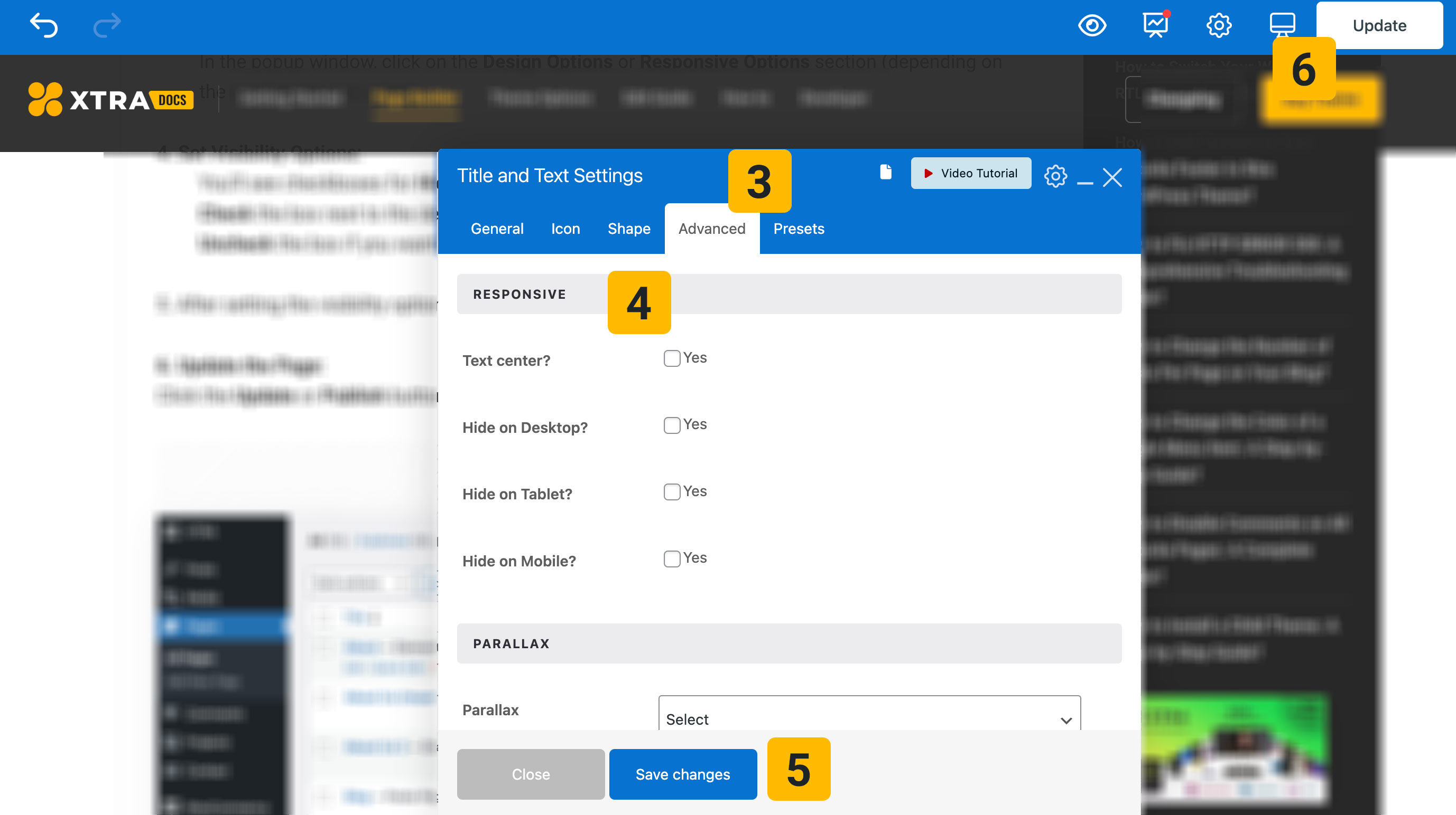
In the popup window, click on the Design Options or Responsive Options section (depending on the version you are using).
4. Set Visibility Options:
You’ll see checkboxes for Hide on Desktop, Hide on Tablet, and Hide on Mobile.
Check the box next to the device where you want the element to be hidden.
Uncheck the box if you want the element to remain visible on that device.
5. Save: After setting the visibility options, click Save or Close to apply the changes.
6. Update the Page:
Click the Update or Publish button to save your changes and make them live on your website.


Tips You Should Know…
- To make an element visible only on mobile: Check “Hide on Desktop” and “Hide on Tablet” and leave “Hide on Mobile” unchecked.
- To make an element visible only on desktop: Check “Hide on Tablet” and “Hide on Mobile” and leave “Hide on Desktop” unchecked.
This way, you can tailor the visibility of elements on your website based on the user’s device, providing a more optimized and responsive design.