Video Tutorial
Description and Screenshot
Step 1
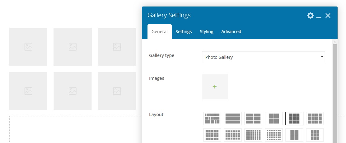
Powerful stylish Gallery element with over 20 different gallery templates. Grid, Masonry, Metro, etc. All parts and styling are customizable.

- Gallery type – There are 3 types Gallery | Instagram | Linakable that you can set custom link to images
- Add images – Add your gallery images one by one each one can have link, title, etc.
- Images – Add your gallery images
- Username or Hashtag – Instagram Username (Account should be public) or Hashtag (Hashtag should be like this #business)
- Count – Number of images to show, Maximum 9 images
- Update cache – Update transient for getting new data from instagram, Recommended 72 hours
- Images size – Instagram images sizes
- Layout – Gallery templates, There are more than 20 gallery styles
- Custom size – You can set custom images size e.g. 400×600
- Images gap – Custom margin / gap between gallery images
- Ideal height – If you set layout 1, So you can set custom ideal height for images
- Hover style – Choose hover style of icon, title and caption of images
- Intro animation – Custom animation for loading images on first load
- Details align – Title and caption position on image or after image
- Hover visibility – Hover details and icon visibility mode, Show on hover or keep showing
- Hover effect – Custom CSS hover effect for icon, title and caption
- Hover image effect – Custom image effect on mouse hover
- Icon – Select icon, this will show on image hover
- Container Styling – Overall styling background, border, shadow, etc.
- Gallery items Styling – Styling for each items such as background, border, shadow, etc.
- Images Styling – Styling for images only, border, shadow, etc.
- Overlay scale – Gallery items have overaly color on hover, You can change scale size of it
- Overlay Styling – You can change overlay hover color or add custom border
- Icon Styling – Style icon on hover with color, size, background, etc.
- Title Styling – Images title styling such as color, font family, size, etc.
- Badges Styling – Linkable gallery items badges styling color, font, size, etc.
- Filter Position – If you set linkable gallery and add class for each items, Then you can have filters.
- Filter Show all – Translation of Show All button in gallery filters
- Filter Container Styling – Styling of overall filters container
- Filter Filters Styling – Each filter styling color, background, size, etc.
- Filter Active filter Styling – Activated filter styling colo, background, etc.
- Filter Filters Delimiter Styling – You can add delimiter between filters, Any charachters allowed
- Carousel Settings – Same as Carousel Settings
- Cursor image – You can set custom cursor on images hover
- Cursor Size and Position – If you set custom cursor, then you can select best size for it
- Advanced tab – Responsive, Animation, Parallax, etc.