Description
Steps to Show or Hide Elements on Desktop, Mobile, and Tablet in Elementor Page Builder
1.Open Elementor Editor:
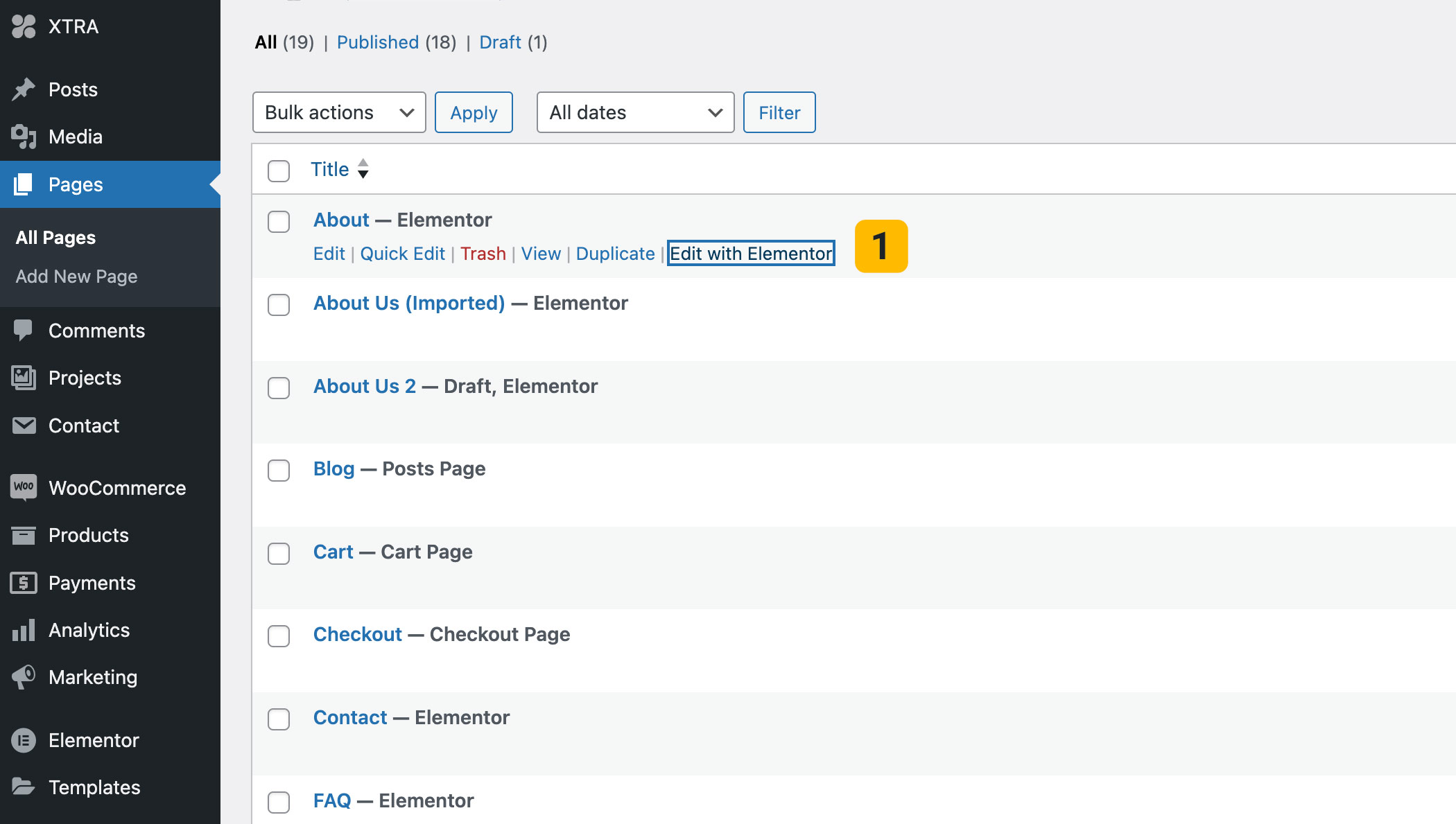
Go to your WordPress dashboard, navigate to the page you want to edit, and click Edit with Elementor.
2. Select the Element:
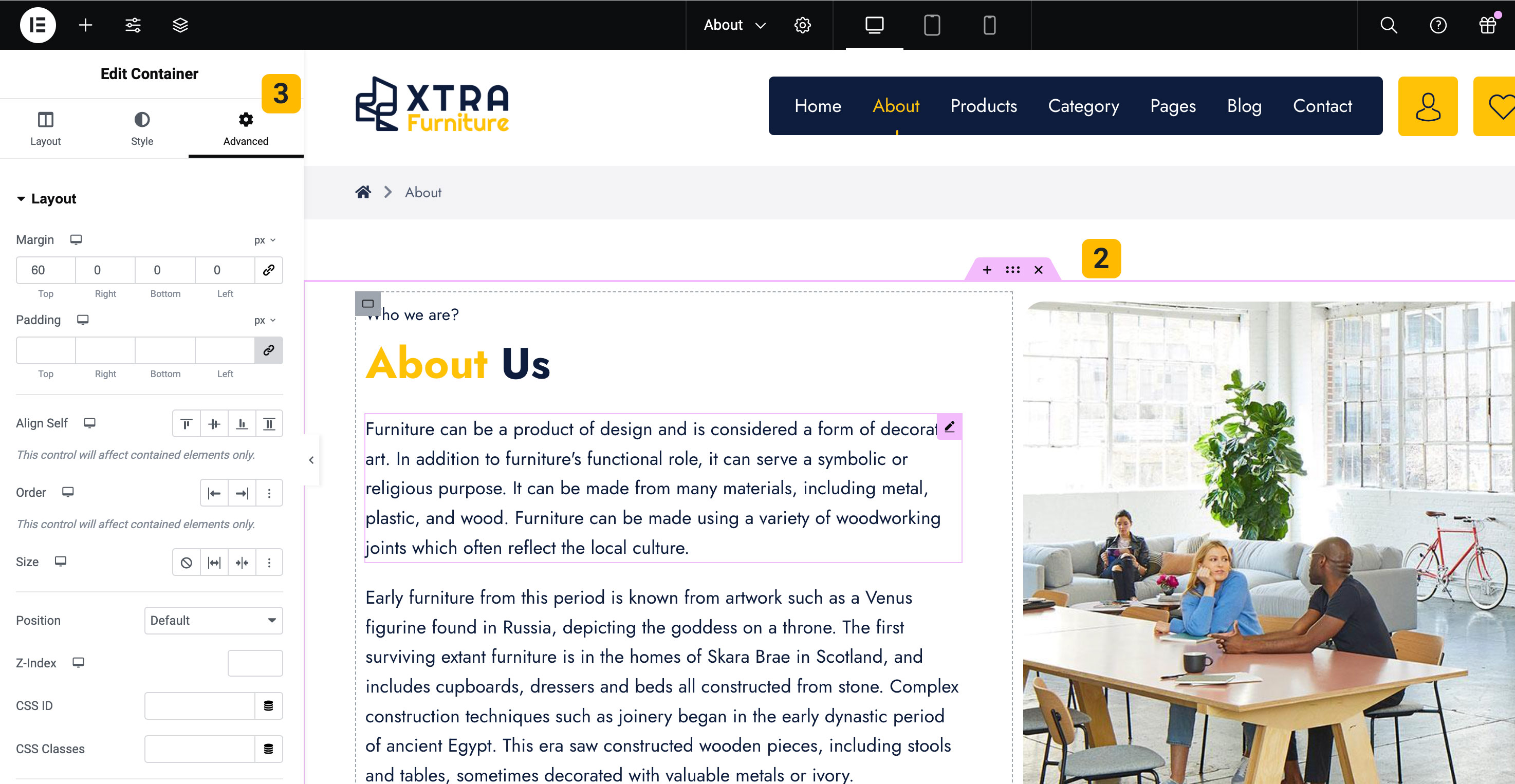
Click on the element (section, column, or widget) you want to show or hide on different devices.
3.Open the Advanced Tab:
In the Elementor panel on the left side, click on the Advanced tab.
4.Go to Responsive Settings:
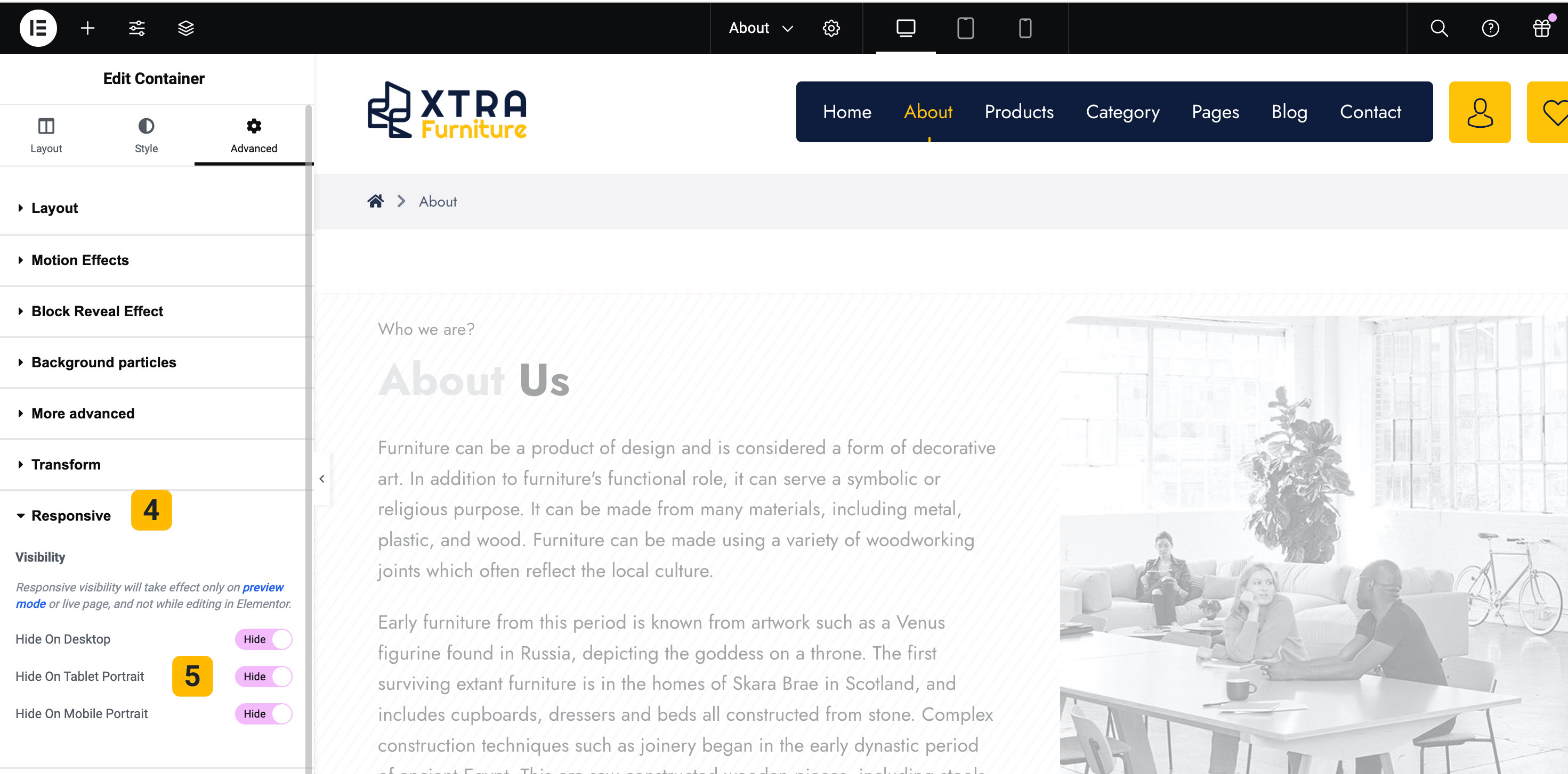
Scroll down in the Advanced tab to find the Responsive section. Click to expand it.
5.Set Visibility Based on Devices:
You will see options labeled Hide On Desktop, Hide On Tablet, and Hide On Mobile. Toggle the buttons for the devices where you want the element to be hidden.
- Hide on Desktop: Hides the element on desktop devices.
- Hide on Tablet: Hides the element on tablet devices.
- Hide on Mobile: Hides the element on mobile devices.
Once you’ve set the visibility preferences, click the Update button to save your changes.


Tips You Should Know…
To preview how your page looks on different devices, you can use Elementor’s Responsive Mode:
- At the bottom of the Elementor panel, click the Responsive Mode icon (a screen icon).
- Select Desktop, Tablet, or Mobile to preview and fine-tune your design.
This gives you more control over how your content is displayed across devices and ensures a better user experience for all visitors.